So this week i have to look up for logos and create mine :). We selected three imaginary companies for our semester and these are: giderayak, caz yap and ali cengiz. I think all of them are great and i dont have any idea about which one i am going to choose. Before design something, i have to look look look more for inspiration. I started to look up from last week, and it is hard to design a logo, and we should not design only one, a lot.
Its hard. I need to look up and get inspired and maybe learn what not to do :). So i started to look up.
a monogram for h and m and for a tourism company offers a free walking tours :).
the monogram is little bit confused for me but i like the color using for logo.

another monogram for h and b. very simple touch can change things a lot.

that reminds me our cropping issue in typography class :). We can still see what are the letters its legible. I think it looks better on prospectur.


The beautiful combination of black and white. Love it.

Simple and beautiful.

They even think about how it is going to be like when its fold. Adore it!


As i started to search more about Mike Rigby, I found more, I love more.

A limited edition book's logo for historically important gays in the history.
Wow! Pretty smart, huh?
Cant stop myself sharing more and more frm Mike Rigby. Here is another logo for theatre.


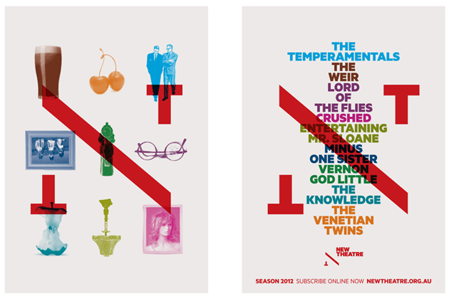

It cuts the ticket into two like its logo :).
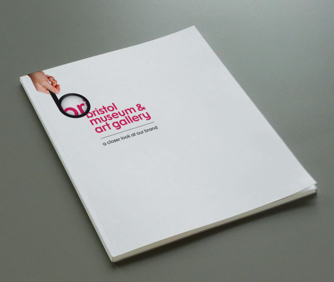
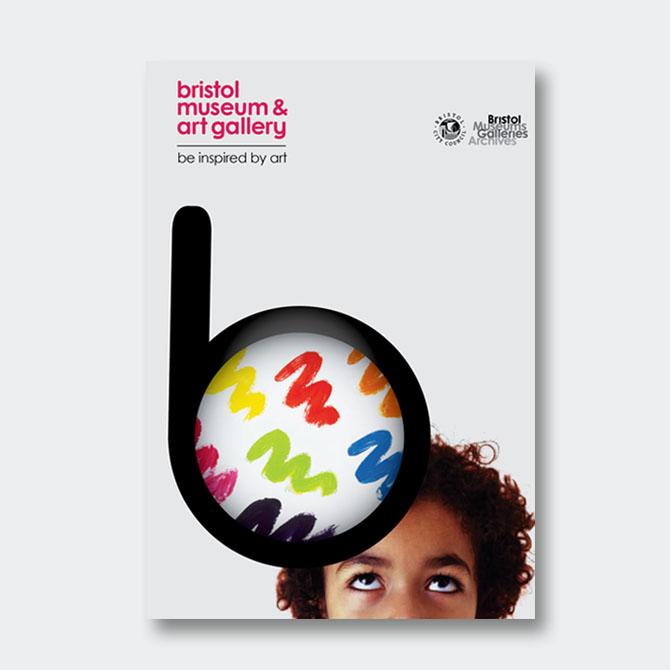
Amazing idea, love the placement of the logo on the book.


Its really looks like my own foundation for animals, maybe we had choose that one i could come up with something like that. Love the idea, colours. Logo is simple but very powerful. Also the usb still have the message but as a design it looks perfect.


artlounge is a place to talk learn and discuss about art. Look at the two talking palettes :).
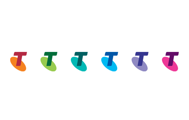
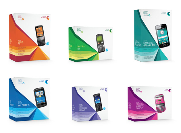
Telsta's colour used to be only blue, but they wanted to change this and create an emotional bond with its costumer so they have new colours for their packages now.


Just like what we are going to do in second semester. Translating the brand on their car, and design its look.

Its an exhibition idendity. The reason i love it, from the very first moment, even though you dont read it
you can still understand that it belongs Gustav Klimt, perfect representation.


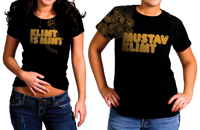
This tshirt is so much better than the other tshirt in my last entry. Its placement and use of drawing is more effective.
When it has a theme, things get funnier.
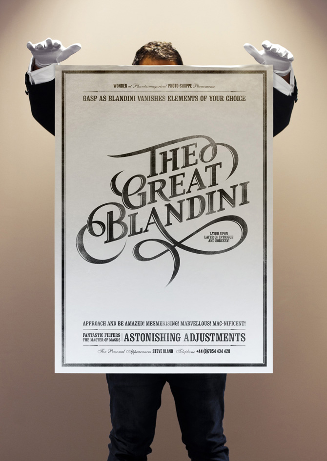


Super duper :). Im sure he has got more job after having this personal card.
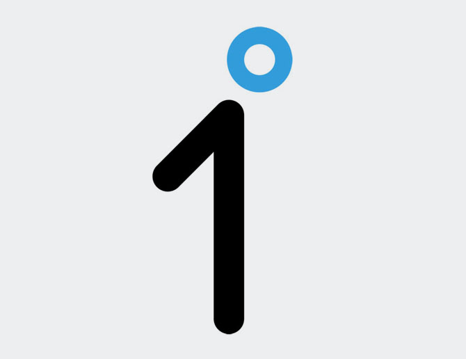
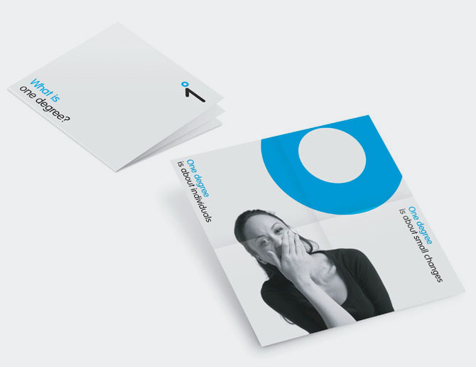
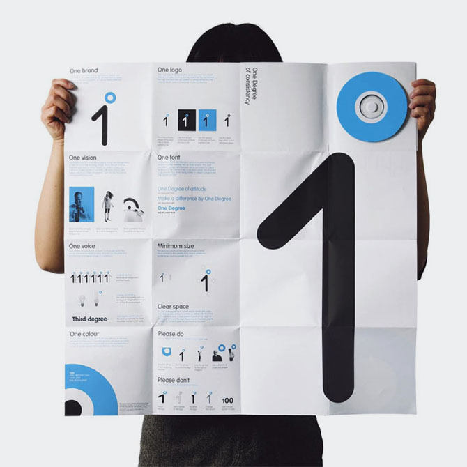
'Small actions can cause big reactions' is the motto of the one degree, its an initiative for people to make small changes and have big differences for themselves and for the world. This logo also symbolises a half person which is extremely smart.


After seeing these beautiful and creative logos, its hard to look for regular websites and like some of them. But i look for more...


I think these are better than my last week logos which i found them 'not so bad' but my favourite ones are Mike Rigby's.
I think i will post more in this week. Time will show.
See you !
Hiç yorum yok:
Yorum Gönder