2 Kasım 2012 Cuma

The Science of Dogs

If you know me a little, you know that how i am in love with animals, especially have a great love affair with dogs. When i was little, i always wanted to be a caricaturist, i was drawing sketches, making stories in my mind about funny stuff, making serials. One of the things that i was drawing at this period was explaining things in a funny way. For example it was a high school girl and i was making little notes all of its places to explain what is she doing or why is she dressed up like that, you can think about it like Umut Sarıkaya's drawings.

So i am in love with all the weird explanation of 'something', like the one i am going to post. I want to share with you a funny one i found of internet 'the science of dogs' its really true and i love the way how it is explained.


Look for, search for... end up looking for posters

Hello;
After doing the creative homework my capacity of thinking surely improved (what kind of sentence is that :D?) Anyway, finally i came up with a logo (an idea lets say) and i will post it to you in a day or two. Meanwhile I started to look for, search for websites if i can improve myself more ( ofcourse because it is just the beginning). Anyway, this morning i woke u and start to look up for images. To create a great logo, or any great idea, from now on i dont think that you should only look for good logos or bad logos. To create something you have to look images and make connections, and they should not be like 'hey there is a obvious connection', you should make people think, tickle a little.

A good new: Second unrelated image homework is on its way! So there is going to be lot of fun again, and i found that homework very fruitful.


I always have interest for posters, their progress of creation, typeface selection, image selection and the image they are going to have. So while i was on acemicaylak  i ended up looking for them :).


That one reminds me my smoker friends thats saying all the time 'okay i know it is not right but i am so sick of people keep reminding me it is bad, you should quit, while i am smoking we both know that i am not going to quit right?' I like in this one there is a contrast, with smoke it says its not right. Normally maybe it should look 'serious' but i found this one funny instead of critical.

It visually catch my eye but for saying jazz using the instrument is boring for me.


I always in love with funny creatures. They look like a family and every one of them is funny.


This one is much more better than the other one. The colors look wonderful and the use of 'm' word as a instrument is clever, and looks perfect as a whole.


I always love drawings, illustrations on posters and that looks perfect. The colors catched me when i look and i also like the placement of writings and placement of the drawing.


That one is strange for me because normally i am not a big fan of showing obvious geometric shapes in posters but when i look at this one it makes me stop and read. It looks like there is a crowd on the poster but not at the same time. I like the colors on the poster but hanging a tree i am not sure that this is the best idea.


I found this one really bad. I did not like it at all. I always love the relationship between black and white but seriously should it have to be like that? I think the designer of this blog just did this in five minutes and go out for a drink. 


26 Ekim 2012 Cuma

exercise for your right brain !

Hello all;

So as i said before im in İskenderun now, but i wanted to make this holiday homework while i have time before the celebration ;).

I have changed lots of ideas for my imaginary company, making up ideas. But i think thats the point, not just thinking about 4 limited photos, but as a whole. I decided to select and one of my 4 list. So here is my four images one by one:


I found them very unrelated, but thats the deal.


So the service is going to be about a bit weird. If you want to see a person/home/place but you dont want people to know about that, here is your chance! We encourage you to go places even your ex boyfriends house without them even notice! But here is the deal, if you want to go there you have to transfrom yourself something belongs to that place, you can be an elevator (which is a little bit risky in the example 1 please choose much unnoticed objects if you dont want to scare neighborhood :P) or you can turn to a reflection on the wall if you wonder are they going to notice or not ;). ITS ALL UP TO YOU !  If you want to take your animal with you we are offering you to a change them as a chair so they wont even noticed and stay with you all the time while you are on your trip. Just lay down on our most comfortable sofa and you are going to be dressed up our metallic dress so you can turned out as whatever you would like to be in that second, in that place.

As a logo i thought about some different stuffs, here is some of my sketches:


Here is the last version of my sketches: In my first sketches i was obsessed with the lines since it was the key of the tripping for my consumers, than i thought about how would it be to add thinking baloons just like in the comics. I tried to combine in some of my sketches but it did not work. Lastly i was focused on brain made up by that lines. Its just a paper for showing the steps of idea making and i like the outcome of that activity, it forced me to think.So the problem is maybe to 'look' for more in my last week.

This was a fun activty for a holiday homework, i hope you enjoy it as much as i do.

24 Ekim 2012 Çarşamba

HEY HO LETS GO

Hello everyone,
Even though im against to this slaughter (bairam) im happy for all of the people visit their family. Im going to İskenderun for visiting my cousin in a few hours but just before i go i want to share up what happened to 'my logos' last week.

I want to keep up this blog as a process blog how far i can come, last week wasnt that much successful.


Here is some of my logos :


So this weeks works as Elif Hoca says 'I did not go crazy' and do any 'tickling' stuff. But maybe this weeks homework can help me about that. My next post is going to be three unrelated images and i will be relate them  somehow. So wait for the next post.


;)

13 Ekim 2012 Cumartesi

Looking for Logos...

Hello...
So this week i have to look up for logos and create mine :). We selected three imaginary companies for our semester and these are: giderayak, caz yap and ali cengiz. I think all of them are great and i dont have any idea about which one i am going to choose. Before design something, i have to look look look more for inspiration. I started to look up from last week, and it is hard to design a logo, and we should not design only one, a lot.

Its hard. I need to look up and get inspired and maybe learn what not to do :). So i started to look up.


a monogram for h and m and for a tourism company offers a free walking tours :). 


the monogram is little bit confused for me but i like the color using for logo.

another monogram for h and b. very simple touch can change things a lot.


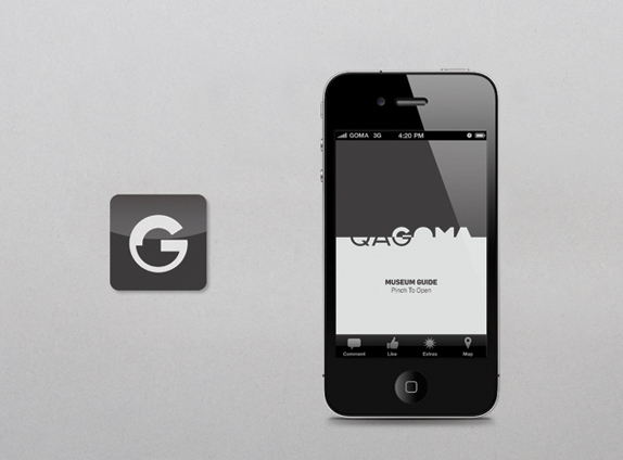
that reminds me our cropping issue in typography class :). We can still see what are the letters its legible. I think it looks better on prospectur.


The beautiful combination of black and white. Love it.


Simple and beautiful.


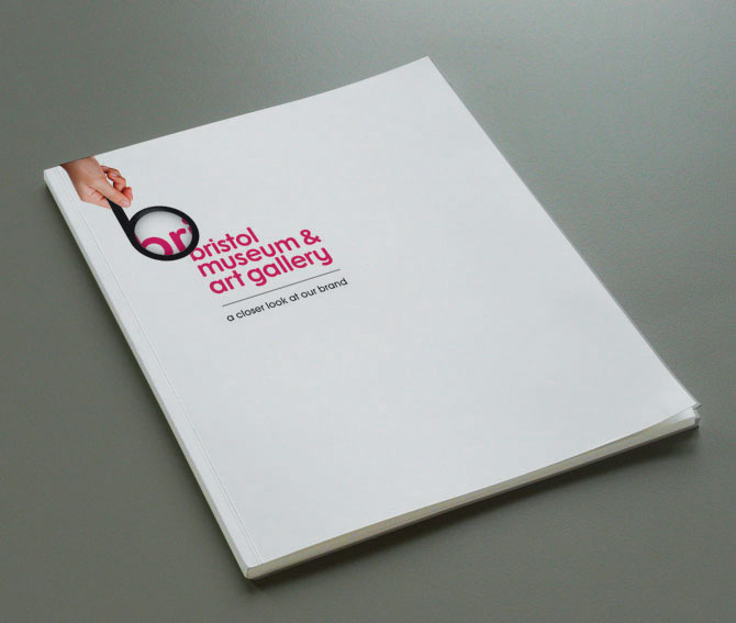
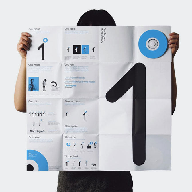
They even think about how it is going to be like when its fold. Adore it!


As i started to search more about Mike Rigby, I found more, I love more.


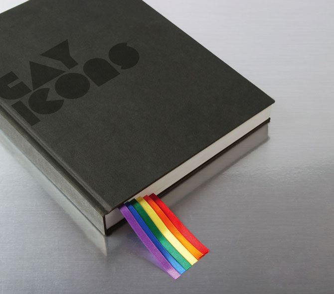
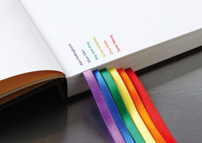
A limited edition book's logo for historically important gays in the history. 


Wow! Pretty smart, huh?


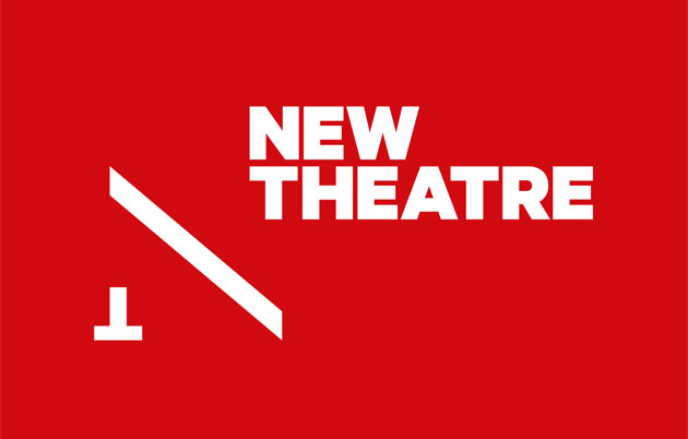
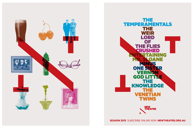
Cant stop myself sharing more and more frm Mike Rigby. Here is another logo for theatre.


It cuts the ticket into two like its logo :).


Amazing idea, love the placement of the logo on the book.


Its really looks like my own foundation for animals, maybe we had choose that one i could come up with something like that. Love the idea, colours. Logo is simple but very powerful. Also the usb still have the message but as a design it looks perfect. 


artlounge is a place to talk learn and discuss about art. Look at the two talking palettes :).


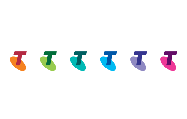
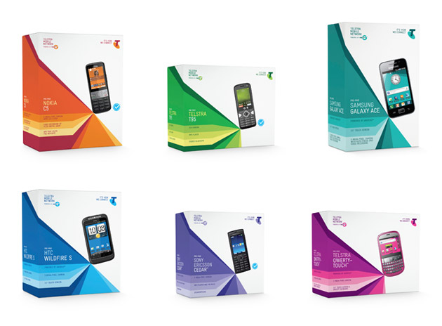
Telsta's colour used to be only blue, but they wanted to change this and create an emotional bond with its costumer so they have new colours for their packages now.

Just like what we are going to do in second semester. Translating the brand on their car, and design its look.


Its an exhibition idendity. The reason i love it, from the very first moment, even though you dont read it 
you can still understand that it belongs Gustav Klimt, perfect representation.


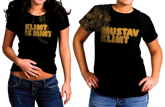
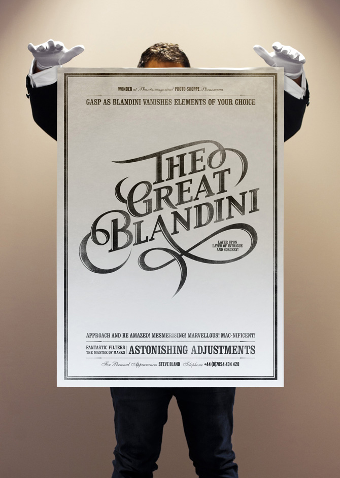
This tshirt is so much better than the other tshirt in my last entry. Its placement and use of drawing is more effective.

When it has a theme, things get funnier.


Super duper :). Im sure he has got more job after having this personal card. 


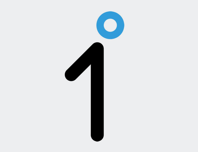
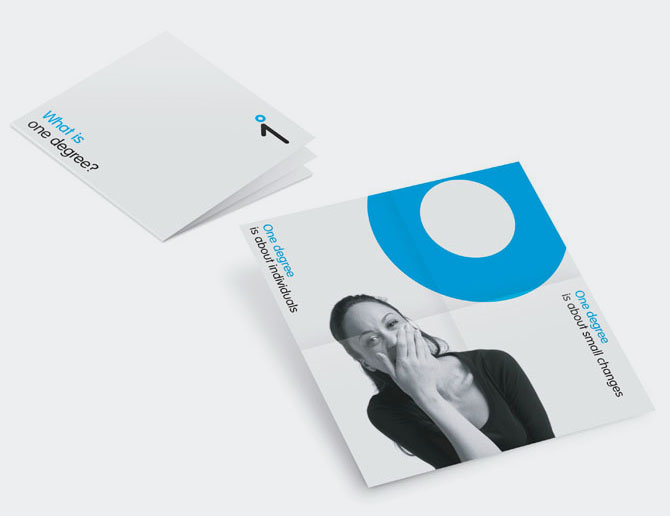
'Small actions can cause big reactions' is the motto of the one degree, its an initiative for people to make small changes and have big differences for themselves and for the world. This logo also symbolises a half person which is extremely smart.


After seeing these beautiful and creative logos, its hard to look for regular websites and like some of them. But i look for more...


I think these are better than my last week logos which  i found them 'not so bad' but my favourite ones are Mike Rigby's. 


I think i will post more in this week. Time will show. 


See you !